Logo system
Primary mark, lockup and symbol
Logo versions for brand, retail and interface use.

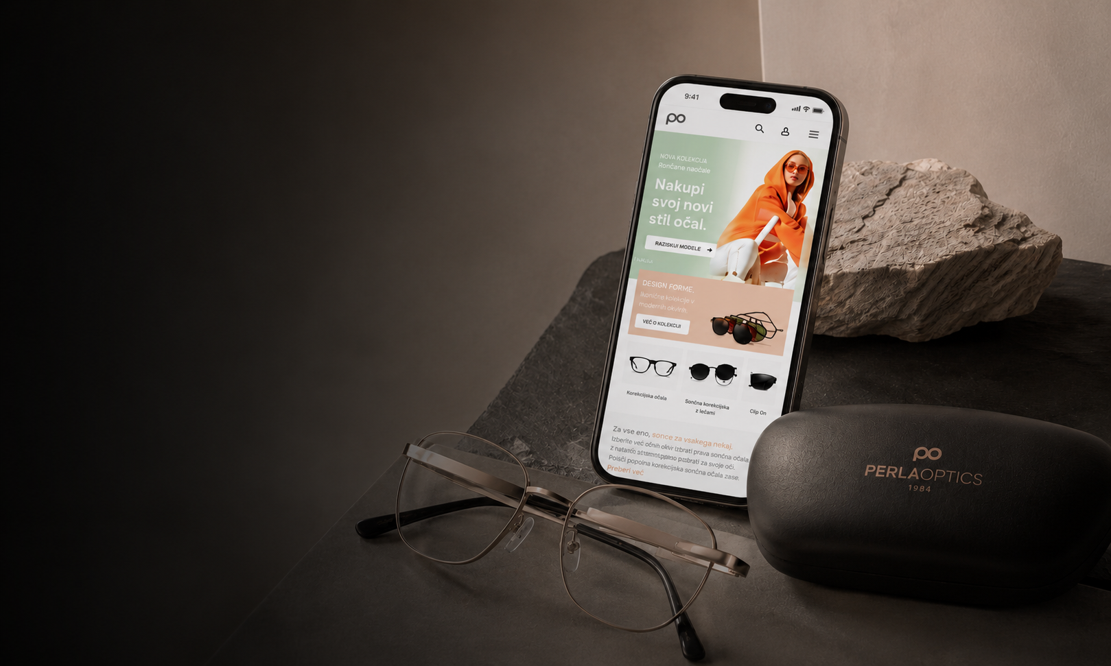
Brand identity and e-commerce UX/UI for Perla Optika. The project covered the identity system, retail applications and a complete webshop experience.
Project holder
Madwise
Role
Identity system and digital retail design
Year
2024
Project overview
The scope included logo rules, colour, typography and retail applications, alongside webshop browsing and purchase flows.
Brand foundation / CGP system
The identity uses Barlow typography, graphite, peach-to-taupe gradients and mint accents. The CGP sets out primary and secondary versions of the PO mark and rules for their use.
Primary colours
#343434
Graphite
#DFB7A1
Perla peach
#C0D8CF
Soft mint
#DFB7A1 → #C69478
Warm gradient
Primary typeface
Barlow
A sans-serif typeface used in CGP documentation, product labels and interface hierarchy.
Aa / 01

Optical retail
Product hierarchy, colour accents and interface labels.
Logo system
Logo versions for brand, retail and interface use.
Colour & type
Brand colours and Barlow typography for print and screen.
Retail consistency
Logo, colour and type rules apply to the webshop and retail materials.
Logo evolution
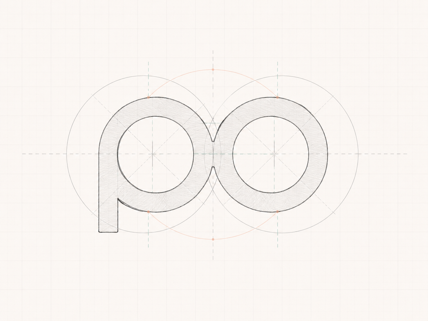
The glasses geometry was simplified into a symmetrical PO symbol for use across brand and retail materials.
Concept
The sketch combines a glasses outline with the letters P and O.
Final mark
The final mark retains the symmetry with softer contours.
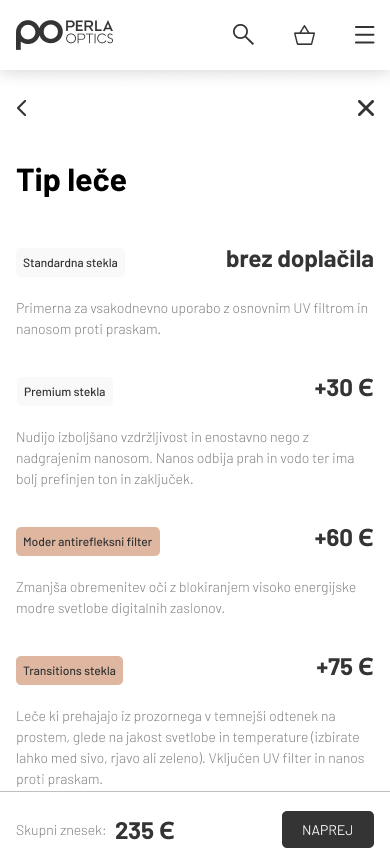
Personalizacija okvirja, dodajanje dioptrije in izbira stekel korak za korakom.
Izbira dioptrije, vrste in debeline stekel v jasnih korakih.
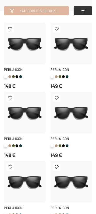
Jasna cenovna kategorizacija korekcijskih in sončnih očal.
Aktivni filtri zožijo ponudbo in ostanejo jasno označeni nad izdelki.
UX/UI showcase
The webshop covers category discovery, frame selection and lens configuration, followed by order review and checkout. The same hierarchy extends to mobile.
Brand applications / retail materials
Vehicle graphics, an optical case, catalogue layouts and brand imagery apply the identity beyond the webshop.
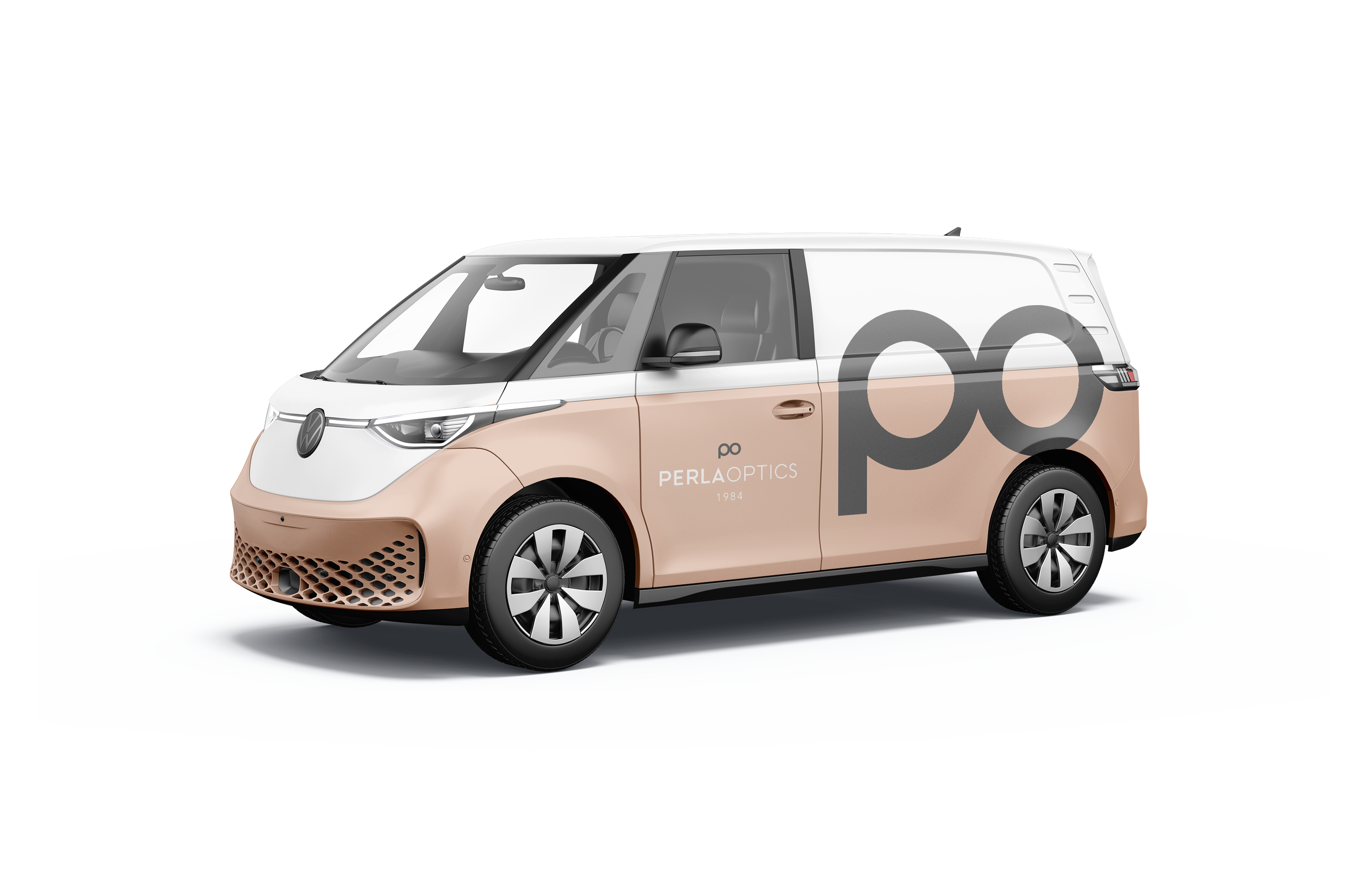
Vehicle graphics
The logo applied to vehicle graphics.
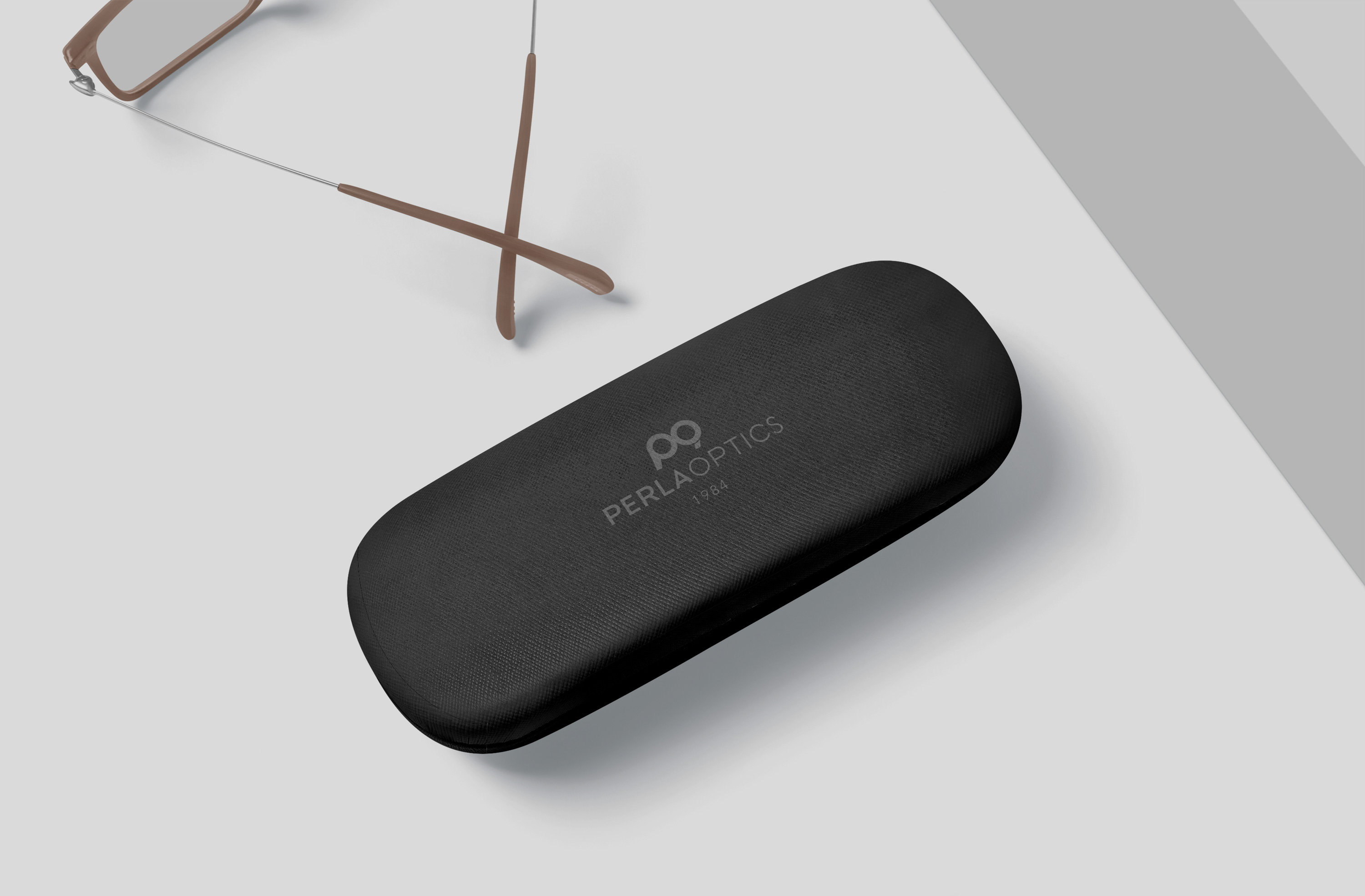
Optical case
The logo at a smaller scale on an optical case.
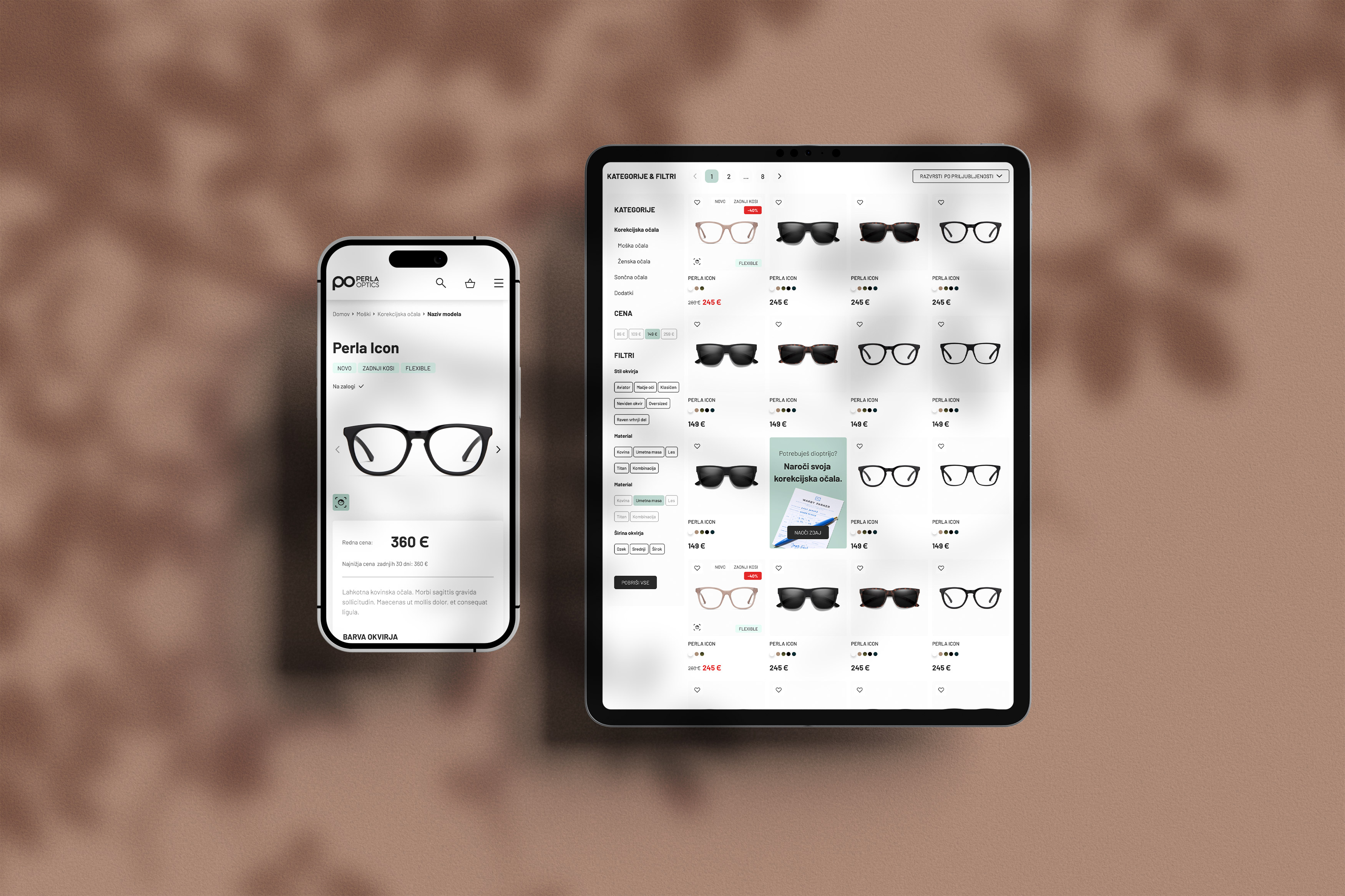
Retail atmosphere
Brand imagery for campaign and retail materials.
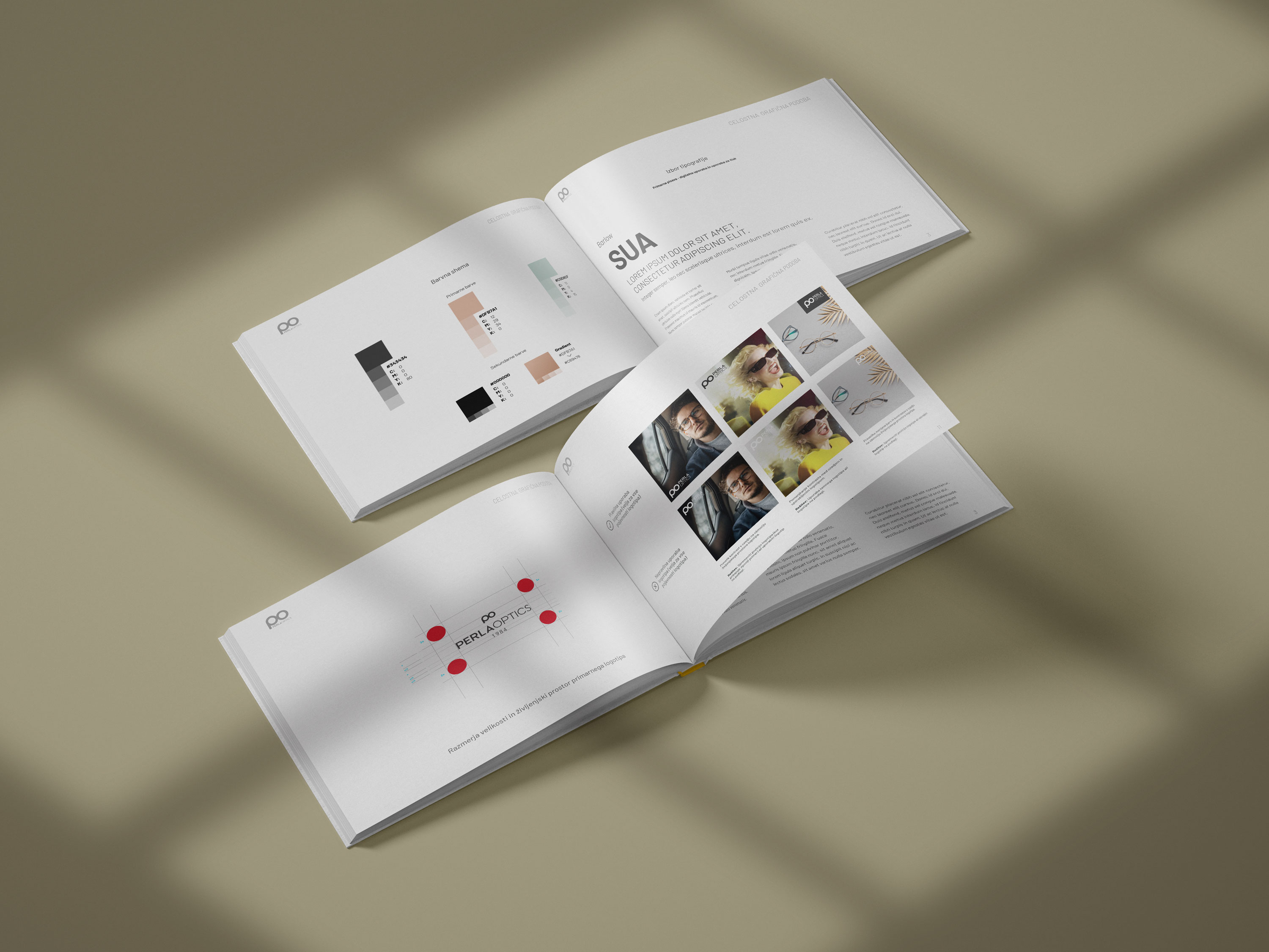
Catalogue system
Product layouts using the brand’s colour and type rules.
Outcome
Logo, type, colour and interface elements were developed as one system and applied across the webshop and physical materials.