

Zelene Doline
UX/UI website design
UX/UI design for product discovery and shopping across the Zelene Doline range.
View live site

Project holder
Madwise
Role
UX/UI design, e-commerce flows and responsive product experience
Year
2026
Product story
The dairy range at a glance.
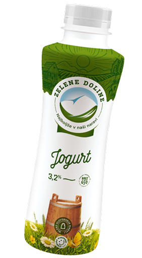
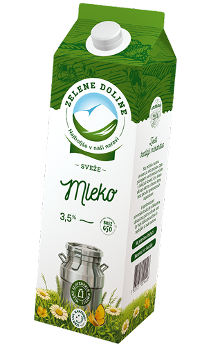
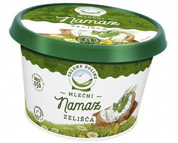
Zelene Doline’s range includes milk, yoghurt, spreads and everyday dairy products. The interface brings product imagery and information together to help shoppers recognise products and browse the range.
Design highlights
Recognizably Zelene Doline.
Six signature details connect the brand’s visual language with product discovery, everyday choices and the path to purchase.
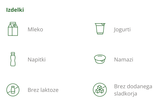






Browse by product or dietary need.
Illustrated categories connect products with dietary needs.


Typography with more character.
Warm serif headlines meet bold product names.
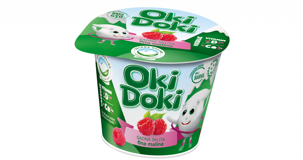



The product stays at the centre.
Product family, flavour and portion size at a glance.

Quantity and price, together.
Quantity controls sit beside a clearly emphasized total.



Three levels of action emphasis.
Read a story, complete a purchase or explore the range.



Search that keeps the query visible.
The query stays visible, with clear and search actions alongside.
Wire frame to interface
Wireframe and interface, moving in sync.
A synchronized mobile presentation shows the structure behind the final interface — from content hierarchy and product discovery to responsive shopping flow.

Selected UI moments
Six key shopping flows.
Product browsing, product detail, store locations, useful content and checkout.
01 / Product discovery
Navigation groups product lines, benefits and categories.
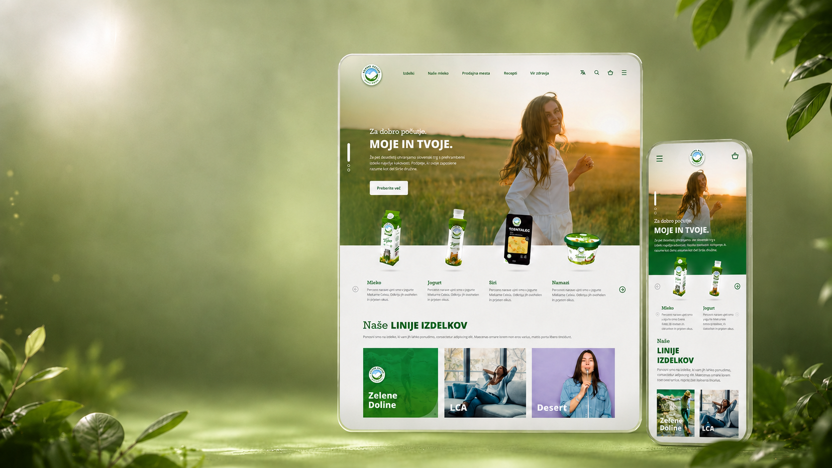
UI showcase
Shopping across desktop and mobile.
Product discovery and browsing adapt to each screen, with a mobile-first shopping flow.
Outcome
A calmer way to browse a broad product range.
The final system brings product discovery, shopping and editorial content into one consistent desktop and mobile experience.